The Micro-Pause That Kills Usability Research
There is a specific moment in usability testing that every product designer recognizes. A participant reaches the login screen. They type a test username, pause for a split second, and look up at the moderator. 'Is this actually working, or should I just tap anywhere?'
That micro-pause is a disaster for your data.
The moment a user realizes they are interacting with a dumb prop, their behavior shifts. They stop acting like a real user trying to accomplish a real task. Instead, they enter 'demonstration mode.' They try to please the researcher, guessing what the prototype expects them to do next. Every metric gathered after that moment—time on task, error rates, cognitive load—is compromised.
Why Financial Tech Demands Brutal Prototype Realism
In standard consumer apps, a fake button might only cause mild confusion. In financial products, fake interfaces instantly ruin trust. Money apps rely on a delicate psychological contract. Users are trained to spot anything out of place: an account balance that fails to sum correctly, a password field that accepts gibberish, or a missing confirmation step.
When a banking prototype hand-waves authentication, participants disengage. They stop testing the core product feature—like transferring funds or viewing investments—because their mind is still stuck on the fact that the login screen was a fraud.
Here is the reality: You do not need a fully coded staging environment to build trust. You just need to make the critical entry points behave like real software.
Step 1: Stop Exporting Flat Images
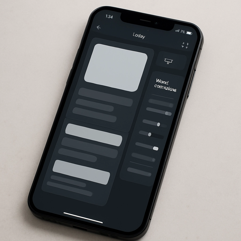
The biggest structural mistake happens before a single interaction is wired. Designers export flattened frames from design tools into prototyping engines. Flattening collapses your visual tree into a single image asset.
To build dynamic logic, export your designs as complete visual scenes. Retain layer hierarchies, precise text nodes, and individual visual containers. If your layer is named 'Rectangle 14', fix it immediately. Rename it 'Input Username'. When you build conditional logic later, descriptive naming saves hours of debug time.
Replacing Static Visuals with Live Inputs
Static text blocks must be replaced with native input fields. Users must be able to tap a box, invoke their actual system keyboard, and type real keystrokes. For password fields, switch the input layer type to masked text. This single property change instantly hides keystrokes behind security dots without writing custom code scripts.
Step 2: Logic Gates and Variable Memory
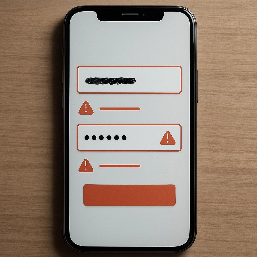
A login screen that lets anyone pass—regardless of what they type—is not a prototype. It is a slide deck. Real software checks credentials, and your prototype should too.
To pull this off, introduce system variables that monitor field contents in real time. Bind text variables to your input components:
username = input('Input Username').textpassword = input('Input Password').text
Next, place a strict condition on your login button. The navigation sequence should only trigger if explicit criteria are met. For instance, set the logic engine to evaluate whether the username matches a test string and the password meets character requirements.
What happens when the input is wrong? That brings us to the most frequently ignored screen state in product design.
The Power of the Real Error State
Most prototypes only map the happy path. But real user behavior is defined by how people handle errors. By setting up an inverse condition on your submit action, you can toggle a hidden error message layer when credentials fail.
Now you can actually research critical questions: Do users read the error text? Do they attempt to reset their credentials? Or do they pivot to biometric alternatives?
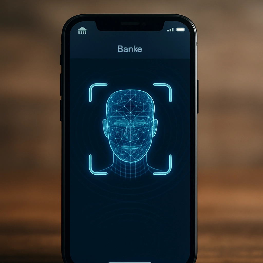
Step 3: Staggered Timing and Native Biometrics
Static transitions feel artificial because real devices process hardware actions over time. Facial recognition does not instant-jump; it camera-scans, verifies, and unlocks.
By integrating vector Lottie animations for biometric routines, you bring hardware feedback into the prototype. But trigger execution matters. If your jump action fires at the exact moment the animation starts, the screen cuts away instantly, destroying the illusion.
To make biometrics feel authentic, stagger your interaction pipeline using deliberate micro-delays:
- 0.0s: Animate the scan interface into view.
- 0.2s: Trigger vector animation playback.
- 0.8s: Run hardware success feedback logic.
- 1.2s: Execute the screen transition.
That subtle sequence of offsets mirrors native iOS and Android system timing, deceiving the user's brain into treating the interface as live software.
Better Data Starts with Higher Fidelity
When your prototype enforces real constraints, user research transforms. Participants stop asking if the field works and start focusing on their actual goal. The feedback you collect shifts from superficial commentary on interface bugs to genuine strategic insights about product utility.
Designers often resist high-fidelity interactive logic because it feels like extra work. But fixing user trust at the front door of your product validation process pays off across every single metric that follows.