The Hidden Flaw in Standard Usability Testing
Most product teams suffer from a dangerous form of confirmation bias. They recruit user research participants who represent the traditional 'general population'—people who navigate digital interfaces with effortless speed, ignore visual clutter, and muscle through broken affordances without batting an eye.
The truth? Those testers are hiding your biggest product flaws. Not on purpose, of course. But their high tolerance for bad design masks critical user experience defects that cost companies conversions every single day.
When Kate Kalcevich, VP of Innovation at Fable, co-chaired an initiative alongside researchers at the University of California, Irvine, she set out to test a specific hunch: do participants with cognitive disabilities uncover deeper usability insights than general population testers?
The findings did not just validate her hypothesis. They exposed a massive structural blind spot in how modern digital products get optimized.
What the Data Actually Tells Us
Let's break down the experiment.
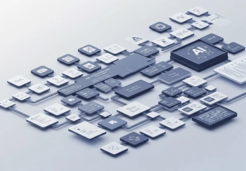
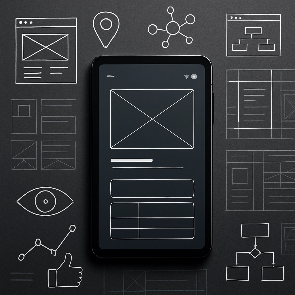
The research team built three distinct AI-generated prototype websites, each presenting different functionality, layouts, and user goals. Strong Snacks featured a straightforward brutalist recipe layout. Turning Pages presented a complex online bookstore with dynamic filtering and recommendation features. Crown & Comb served as an intentionally dense salon booking platform filled with complex pricing packages.
They conducted 30 live, facilitated user interviews. The cohort was split evenly between standard testers and participants with cognitive disabilities—including individuals with ADHD, Autism, Dyslexia, and self-identified focus or memory challenges.
The final counts were stark.
General population participants identified 113 total usability issues and offered 54 suggestions for improvement across all three sites.
Cognitive participants identified 197 usability issues and pitched 93 suggestions.

Look closer at those figures. Participants with cognitive accessibility needs uncovered 1.8 times more issues and generated 1.8 times more actionable suggestions than traditional research cohorts. They did not just find more bugs—they pinpointed foundational design flaws that standard users ignored or tolerated.
Behind the Numbers: Content, Affordances, and Mental Fatigue
Why did this massive gap occur? It comes down to how different brains process interface friction.
Standard testers frequently power through broken interface elements. When a button lacks visual contrast, or when a navigation tab sits in an unexpected spot, a general population participant rolls with the punches. They complete the assigned task, close the browser, and offer mild feedback like 'the checkout felt a bit slow.'
Cognitive testers don't just notice those friction points—they hit hard operational barriers.
In the study, cognitive participants surfaced far more defects related to content clarity, missing button affordances, confusing icon design, and distracting auto-playing media.
Consider the salon booking site, Crown & Comb. A general population tester described a confusing appointment selection loop as 'frustrating and not particularly engaging.'
Contrast that with a cognitive participant's evaluation of the exact same interface: 'It makes me feel drained and less able to focus.'
That difference is profound. One group sees a minor annoyance. The other experiences total mental exhaustion.
The Universal Benefits of Designing for Cognitive Diversity
Here's the catch: cognitive load isn't isolated to neurodivergent individuals.
Eliminating cognitive friction benefits literally every human who interacts with your digital ecosystem. Think about your actual audience in the real world:
Gen Z users who operate in rapid micro-attention loops and abandon text-heavy pages the moment context becomes ambiguous.
Older adults who naturally experience age-related cognitive decline alongside diminishing eyesight and reduced fine motor control.
Overworked adults attempting to execute online transactions while commuting on a loud train, holding a toddler, or dealing with constant push notifications.
When an interface demands excessive working memory, bounce rates soar. High cognitive load destroys task completion rates, lowers purchase intent, and quietly kills brand credibility.
If your UX research excludes participants who process information differently, you are intentionally shipping digital products with structural flaws.
Tactical Steps for Optimization Teams
How should design and product teams adapt their user research pipelines?

First, update your recruitment screeners immediately. Explicitly recruit participants who experience memory, focus, and learning challenges. Partner with specialized accessibility panels to source authentic feedback.
Second, rethink your evaluation metrics. Standard metrics like overall task completion speed can deceive you. A tester might complete a flow, but if doing so required immense mental energy, the user experience failed.
Third, act aggressively on qualitative commentary regarding visual clutter and content hierarchy. In the Fable study, cognitive testers highlighted that recipes on Strong Snacks broke reading patterns and demanded clearer context in section headlines.
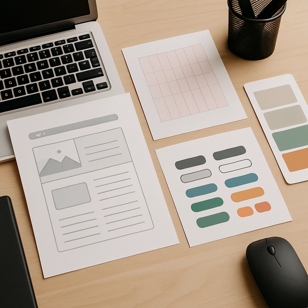
Pay close attention to visual cues. Ensure interactive elements look explicitly clickable, streamline text-heavy sections, eliminate intrusive pop-ups, and keep layout structures predictable. Simplifying the path for cognitive accessibility inevitably yields a faster, slicker experience for everyone else.