The Web Contrast Crisis and the CSS Fix We Desperately Needed
The open web has a persistent accessibility problem. Year after year, automated web audits point out the exact same embarrassing flaw: illegible text contrast. We threw everything at the issue for over a decade. Design system tokens, CI linters, automated accessibility tools, complex JavaScript color calculation libraries. Nothing moved the needle. Over eighty percent of high-traffic homepages still fail standard WCAG contrast checks.
Relying on runtime scripts or heavy build steps to compute basic reading contrast simply does not scale across millions of websites. We never needed another JavaScript utility package. We needed browser-native engine intelligence. Enter contrast-color().
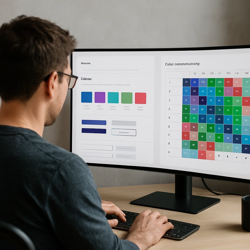
One simple CSS declaration shifts the mathematical heavy lifting directly to the browser rendering engine. During style computation—before the page even paints—the engine calculates background luminance and outputs an accessible text color on the fly. No library, no build step, no theme hydration flash. You update a custom property at runtime, and the typography instantly adapts without event listeners or re-renders.
Level 5 vs Level 6: What Ships Today and What Lies Ahead
The technical architecture of this feature spans two CSS specification levels. Level 5 defines what browsers support right now. You pass a single color into the function, and it returns pure black or pure white. That is it. If you remember reading about color-contrast() in older design blogs from a few years ago, toss that syntax out completely. The CSS Working Group renamed it to contrast-color() to align with functions named for what they return. The old syntax is dead and unsupported in modern browsers.
Look closer at the Level 5 implementation. The spec deliberately marks the underlying contrast algorithm as standard-defined or User-Agent defined. Today, every major browser engine uses classic WCAG 2.x relative luminance math under the hood. However, that deliberate vagueness is a planned structural escape hatch.
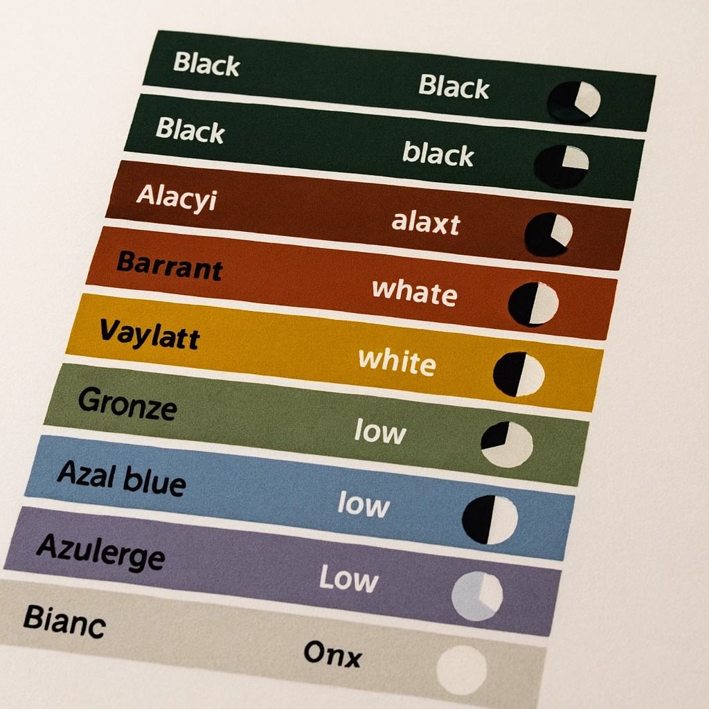
You will hear developers bring up APCA (Accessible Perceptual Contrast Algorithm) in these conversations. APCA models human eye perception far better than legacy WCAG formulas, factoring in spatial frequency, font weight, and ambient environment. But APCA remains in flux within the WCAG 3 working draft. If the CSS specification had hardcoded legacy WCAG 2 math into Level 5, every web application using the feature would be permanently locked into outdated color science. The UA-defined flag means browsers can upgrade to refined perceptual math in the future without breaking existing code bases.
Level 6 will eventually bring candidate color lists, explicit contrast targets, and directional contrast keywords. But Level 6 remains early working draft territory. Level 5 is what provides solid production utility today.
Browser Support and Modern Progressive Enhancement
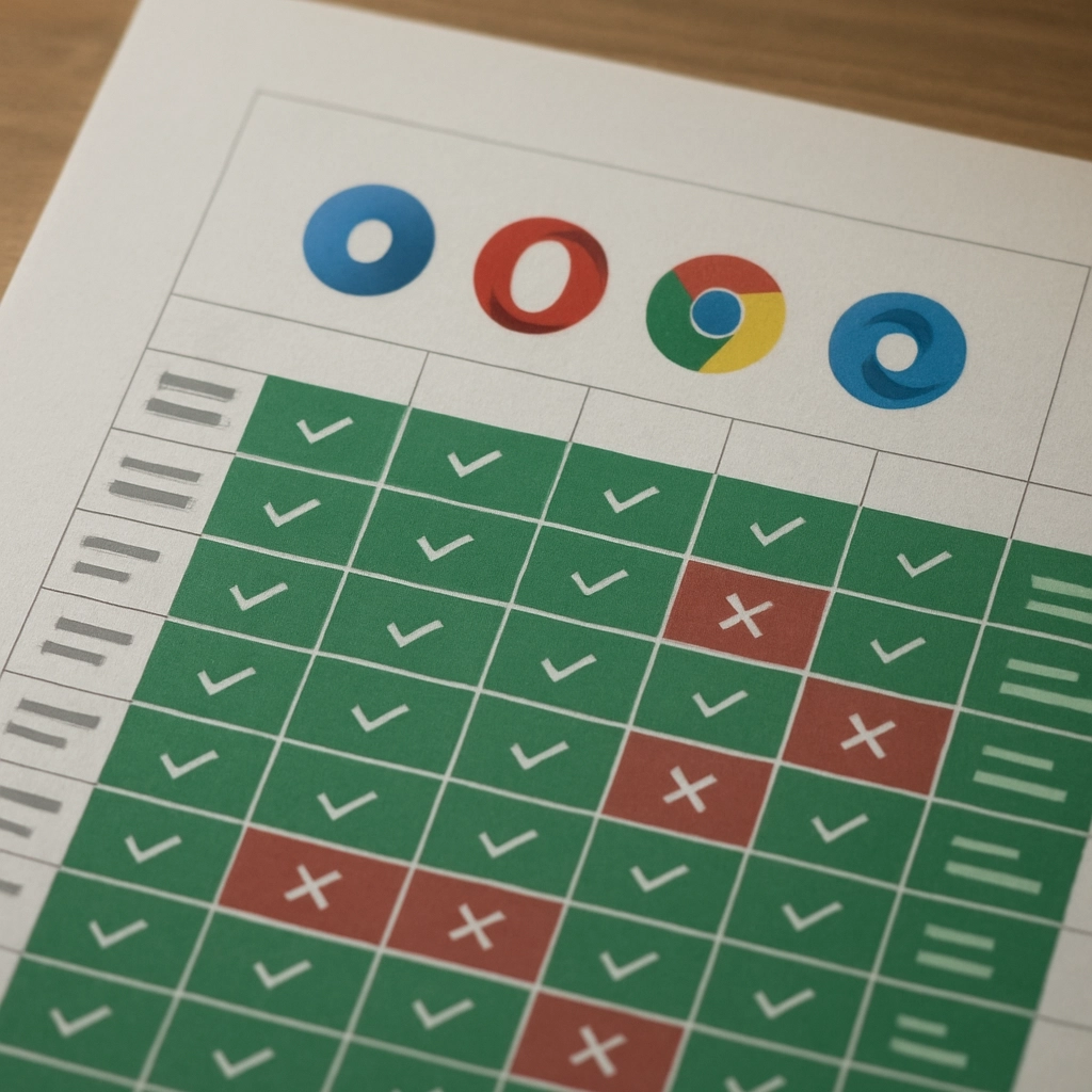
Engine alignment happened remarkably fast for this feature. Stable releases of Chrome, Firefox, and Safari all pass the Web Platform Tests for basic contrast evaluation, establishing a solid baseline across major rendering engines. Edge cases like syntax parsing and tie-breaking behavior work identically across platforms.
Even with widespread support, enterprise update cycles mean progressive enhancement remains mandatory for production design systems. The strategy is straightforward with feature queries:
.card {
  background: var(--bg);
  color: #ffffff;
  text-shadow: 0 0 4px rgba(0, 0, 0, 0.8);
}
@supports (color: contrast-color(red)) {
  .card {
    color: contrast-color(var(--bg));
    text-shadow: none;
  }
}
Older browsers receive crisp white text paired with a legible drop shadow. Supporting browsers bypass the shadow and execute native runtime calculations. Nobody experiences invisible typography.
Here's the catch: automated accessibility scanners like Lighthouse or Axe cannot evaluate CSS text-shadow layers. They only measure raw computed color values against the declared background-color. That means your fallback rule will likely flag a false positive in automated CI/CD pipelines, even though the human visual experience is entirely readable. Teams running continuous accessibility audits must allowlist these specific fallback rules.
Furthermore, avoid relying on PostCSS build plugins if your architecture uses custom properties. Build plugins evaluate static values like red or blue at compile time. The moment you write contrast-color(var(--bg)), build tools fail because they lack access to runtime CSS variables. Skip polyfills for dynamic theming and rely directly on feature detection.
The Practical Edge Cases and Hidden Gotchas
Let's break it down: native contrast calculation is not a total silver bullet. Writing the function does not automatically mean your user interface passes every human usability check. Under WCAG 2.x math, there is technically no background color where both pure black and pure white fail the 4.5:1 AA ratio. Mathematically, one option always passes. But mathematics and human vision do not always agree.
Take mid-tone colors like medium royal blue. Mathematically, black text on medium blue hits the AA threshold, so the function hands you pure black text. Visually? It creates severe optical strain. The math technically passes compliance audits, but the perceptual experience remains poor.
Aiming for strict AAA compliance (a 7:1 ratio) reveals a true dead zone. For background relative luminance values sitting between roughly 10% and 30%, neither pure black nor pure white hits 7:1. In those mid-tone ranges, the browser simply hands you the less severe failing option.
Animation mechanics present another technical bump. Hovering over an element while transitioning background shades produces unexpected visual behavior:
.btn {
  background-color: #ffffff;
  color: contrast-color(#ffffff);
  transition: background-color 1s, color 1s;
}
.btn:hover {
  background-color: #000000;
  color: contrast-color(#000000);
}
The background color interpolates smoothly over one second. But because Level 5 outputs discrete binary values (black or white), text color cannot smoothly crossfade. It snaps hard.
Because relative luminance scales non-linearly, that hard snap does not occur halfway through the transition duration. The mathematical tipping point between black and white contrast sits around 18% relative luminance. During a white-to-black fade, text stays black across eighty percent of the transition time, snapping to white only at the absolute dark end of the curve. Setting transition-behavior: allow-discrete shifts the snap timing to the exact midpoint, but it still cannot interpolate binary output values.
Other operational limits to remember: single flat colors are required. Passing linear gradients or image paths creates a CSS syntax parse error. For semi-transparent colors, the browser composites the alpha channel against an assumed white canvas before running contrast math. When Windows High Contrast Mode activates, forced system colors override author rules completely, causing the function to yield control to system typography settings automatically.
Going Beyond Black and White: Relative Color Composition
Pure black typography on vibrant brand backgrounds can look harsh. Pure white text on soft pastel surfaces often feels completely detached from the visual language. Pairing contrast-color() with CSS Relative Color Syntax solves this visual compromise gracefully.
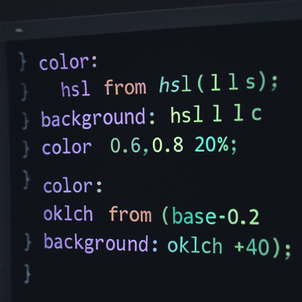
By using relative color syntax, you extract the functional lightness decision from the native calculation, then re-inject your brand's specific OKLCH hue and chroma variables. The engine determines whether the surface requires a light or dark foreground, while your relative color rules generate a deep indigo or a soft tinted cream instead of stark black or white.
You feed your design engine a single surface color token, and the browser automatically derives readable tinted typography, contextual borders, and high-contrast focus rings. No heavy JavaScript runtime required, no build step locks, and zero manual contrast recalculation when themes swap dynamically.